how you could use Flask and Jinja2 templates to create a responsive 1×3 grid of images using Bootstrap, with a text label field and download button for each image:
Creating Dynamic responsive 1×3 grid of images using Bootstrap,dynamic Bootstrap Image grid
How To Create a Responsive Image Grid Using Bootstrap
Here is an example of a responsive 1×3 grid of images using Bootstrap:
# in app.py

from flask import Flask, render_template
from flask_sqlalchemy import SQLAlchemy

app = Flask(__name__)
app.config['SQLALCHEMY_DATABASE_URI'] = 'sqlite:///image_data.db'
db = SQLAlchemy(app)

class ImageData(db.Model):
    id = db.Column(db.Integer, primary_key=True)
    img_url = db.Column(db.String, nullable=False)
    name_text = db.Column(db.String, nullable=False)
    created_at = db.Column(db.DateTime, default=datetime.utcnow)

@app.route('/')
def index():
    img_list = ImageData.query.all()
    return render_template('Dynamic_image_grid.html', img_list=img_list)
# in Dynamic_image_grid.html

<div class="container">
  <div class="row">
    {% for img in img_list %}
    <div class="col-sm-4">
      <img src="{{ img.img_url }}" class="img-fluid" alt="{{ img.name_text }}">
      <div class="form-group">
        <label for="{{ img.name_text }}">{{ img.name_text }}</label>
      </div>
      <a href="{{ img.img_url }}" download class="btn btn-primary">Download</a>
    </div>
    {% endfor %}
  </div>
</div>
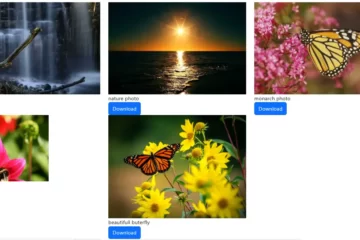
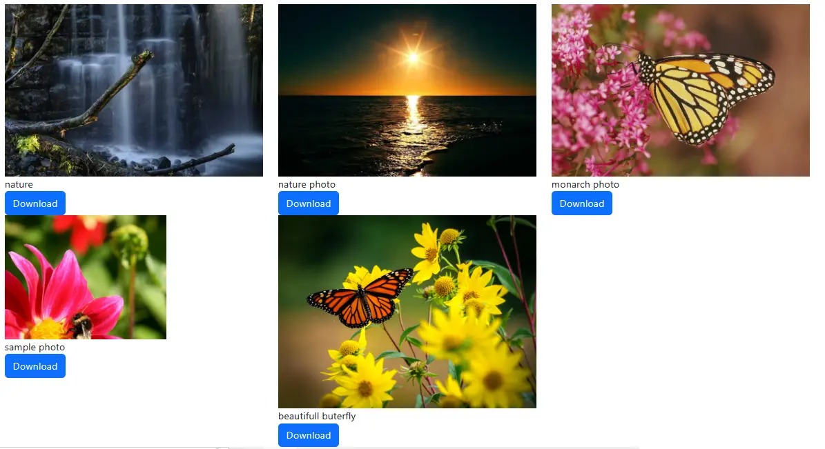
In this example, an ImageData class is defined with 3 columns: img_url, name_text, and created_at. The img_list variable is set to the result of querying all the rows in the ImageData table. This variable is then passed to the Dynamic_image_grid.html template, where a responsive 1×3 grid of images is created using the Bootstrap grid system and the img-fluid class. For each image, the name_text column is used to display a label and the img_url is used to create the image and the download button. Jinja2 is used for the templating engine in this example, where the for loop iterates over the img_list to create the grid of images.
Please note that, you need to have the bootstrap css and js added in your html file for it to work as expected.
Source Code in Bootstrap, Having Responsive 1 x 3 grid of images With images name text field and a download image button to that image
Grid system – Bootstrap
Here is an example of a responsive 1×3 grid of images using Bootstrap:
<div class="container">
  <div class="row">
    <div class="col-sm-4">
      <img src="image1.jpg" class="img-fluid" alt="Image 1">
      <div class="form-group">
        <label for="image1name">Image 1 Name:</label>
      </div>
      <a href="image1.jpg" download class="btn btn-primary">Download</a>
    </div>
    <div class="col-sm-4">
      <img src="image2.jpg" class="img-fluid" alt="Image 2">
      <div class="form-group">
        <label for="image2name">Image 2 Name:</label>
      </div>
      <a href="image2.jpg" download class="btn btn-primary">Download</a>
    </div>
    <div class="col-sm-4">
      <img src="image3.jpg" class="img-fluid" alt="Image 3">
      <div class="form-group">
        <label for="image3name">Image 3 Name:</label>
      </div>
      <a href="image3.jpg" download class="btn btn-primary">Download</a>
    </div>
  </div>
</div>